|
|
|
WESTPEX® 2024 |
||||||||
|
Stamp Show |
||||||||
|
Steps in the design of the WESTPEX 2007 Souvenir Sheet by Bill Dwyer, WESTPEX Committee Background WESTPEX, the Western Philatelic Exhibition, is the largest annual stamp show in the Western United States and one of a handful of major U.S. stamp shows. While many stamp related activities are struggling with declining attendance, WESTPEX has continued to be a notable exception. This success is the result of a skillful chief executive, an unusually large and hard working group of volunteers, and a strong marketing effort. In 2005, the WESTPEX Board selected the 100th Anniversary of the 1906 San Francisco earthquake as a theme. I'd been designing color postcards to promote WESTPEX for several years. Being a cinderella collector, the idea of an earthquake anniversary souvenir sheet appealed to me. I used Photoshop to combine images from old postcards and a modern photo of San Francisco into the picture of an imaginary four stamp souvenir sheet. The image of this imaginary souvenir sheet became the dominant element of the WESTPEX 2006 promotional postcard.
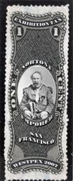
Ed Jarvis, WESTPEX's Chairman, asked me to look into getting the stamps from the postcard produced for his use as Christmas gifts for the WESTPEX volunteers. That led to a decision to produce 1000 of the souvenir sheets for sale at the show itself. Both the card and the sheets were a success. The stamps were given prominent coverage in the philatelic press and the basic design was also reproduced on T Shirts, by the Post Office, for sale at the show. Finding a Theme for 2007 Suddenly we had a new WESTPEX tradition, so I began the search for a theme for the 2007 WESTPEX Souvenir Sheet. Each year WESTPEX hosts two or three stamp societies who provide a large part of the exhibits and hold special meetings at the show. For 2007, one of those societies is the American Revenue Association. I've always liked the ornate engraved designs of the Private Die Proprietary (PDP) revenue stamps and started to think about what kind of revenue stamp would be appropriate for the show. At the same time I was looking for anniversaries we might honor. The two clicked when I discovered a trivial but uniquely San Franciscan anniversary - the 140th anniversary of the arrest and immediate release of Emperor Norton I. Norton I, Emperor of the United States Joshua Norton was born in London in 1819. He arrived in San Francisco from South Africa in 1849 with the sum of $40,000. In 1854 he lost the considerable real-estate fortune he had built up in a failed attempt to corner the rice market. On September 17, 1859 he released his first proclamation At the peremptory request of a large majority of the citizens of these United States, I Joshua Norton, formerly of Algoa Bay, Cape of Good Hope, and now for the last nine years and ten months past of San Fransisco, California, declare and proclaim myself the Emperor of These United States. This was the first of many proclamations These included commanding that the Golden Gate bridge be built and one about the name of the city, "Whoever after due and proper warning shall be heard to utter the abdominal word 'Frisco,' which has no linguistic or other warrant, shall be deemed guilty of a High Misdemeanor." Penalty for noncompliance was $25. Newspapers of the day printed his proclamations (and even made some up which were not from Norton!). San Francisco has always been a community of independent and unusual people who migrated to the left edge of the country to make their own lives. As such, we love oddball characters and people with big, unique personalities. There are many examples from before the gold rush right up through Wavy Gravy in the 60s and beyond. On With the Design As a designer, I'm a good thief. Years ago I bought a small collection of PDPs (sometime less formally labeled Match & Medicine). For a while the federal government gave makers of matches, medicines, perfumes and playing cards the option of producing their own adhesives to show they had paid the required taxes. They received a discount for doing so not to mention advertising space on the stamp itself. Such a private-issue revenue stamp seemed a natural for Norton so I went looking for one that appealed to me with room for a nice vignette of the Emperor. The one I choose was original issued by John F. Henry of College Place, New York. In the collection I acquired, I had three so-so copies which I then scanned at very high resolution. You can see in the illustration that follows that centering wasn't wonderful on any of the copies.
I selected the right most copy of the stamp and removed all the coloring (all this work was done in Photoshop CS2). That left me with the image in Figure 4. Even at the reduced resolution used here you can see it's a nice clear image. It's only an average stamp however with poor centering and some weak perfs.
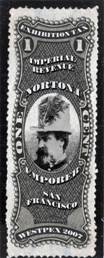
The next step was to see how easy or hard it was going to be to remove the text while retaining the lovely engraved background. For this I used the rubber stamp or cloning tool which let me duplicate pixels from areas where there were no words to areas covered with lettering. Figure 5 shows the first result. You can see it's anything but perfect when you inspect the background in detail. The final is better than this example but even this when covered again with text wouldn't be all that noticeable. Improving the Centering Note that I didn't bother with the word Proprietary at the bottom because I had already decided that I was going cover that up by improving the centering. To fix the vertical centering I copied a small amount of the top of the stamp and rotated it 180 degrees (Figure 6). I then merged it with the stamp resulting in Figure 7 (If you know Photoshop, you know that merging isn't really what I did. Each of these images was on a different layer. My final play space for this image had 21 layers). Bring on the Type Next I needed to locate a type font suitable to replace the wording with new words appropriate to Norton. If you know type you know there are hundreds of thousands of ways to print the alphabet. PDPs however, like many other revenues, all used similar fonts characterized by very thick sections contrasting with thin ones in the other direction. Look at the E in ONE for example. The fonts used are always serif fonts (little extra strokes on the letters which improve readability) and the ends of the characters including the serifs are often triangular. The one I found is called Falstaff distributed by Adobe. Its description says "Falstaff is based on types cut by various German foundries at the beginning of the twentieth century. Falstaff is a very heavy typeface with fine hairlines and serifs, a strong vertical stress and large x-height. " Here's a sample:
Once I had a font I could experiment with it, as shown in the Figure 8, using Photoshop's tools to place type along different curves. That same technique without the automation was often used in decorative 19th century type. What you see to the left isn't a final - note the misspelling and the jarring coloring - just an example of playing with the elements on the way to the final.
Himself The last key element was a picture of the Emperor that I could make look like an engraving. I started with a seated image that captured the Emperor's wonderfully confused expression. When I tried to make it more like a line engraving you lose most of the expression. Ultimately I found a badly reproduced newspaper head shot that I went with. I used the cloning tool to copy engraving patterns from the original stamp vignette. A composite with the final vignette is shown here. It still needs some work on font shading and the like but it's not bad.
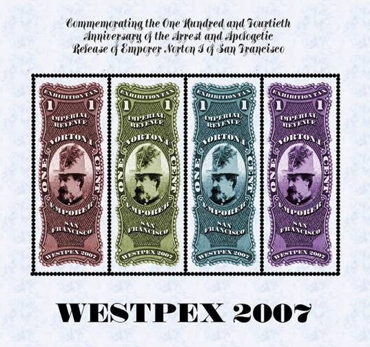
Leaving History Behind PDPs didn't ever come in souvenir sheets so at this point I was leaving history for imagination. I decided that four colorized versions of the stamp would make a great looking sheet. The sheet would also give me room to talk about the event we were honoring. An early try at a souvenir sheet is at the top.
The simulation of perforations is awful and the font at the top is too hard to read. Ultimately I simulated the perfs by creating lines of empty circles in Adobe Illustrator. Once imported into Photoshop I could use layer effects to create shadows within the circles making them look very realistic. The final sheet heads up this article. The real one has perfs through the top and bottom margin because the inset perfs in the simulation are outside of our vendor's perforating capabilities. Sheets will be for sale at WESTPEX in April 2007 for $5. I'll be on hand during some of the show to autograph them as I did last year. Come by and say hello. Additionally, the imagery has found its way on to shirts, coffee mugs, plaques, mouse pads, etc. Those are for sale now at the WESTPEX website. Every purchase benefits WESTPEX, a 501(c)3. If you would like a printable version of this story, you can download it as a pdf and print it. |
||||||||
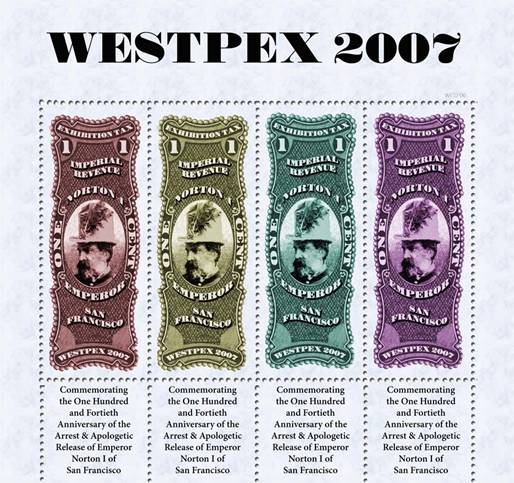
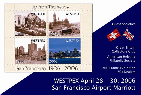
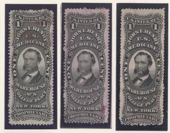
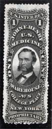
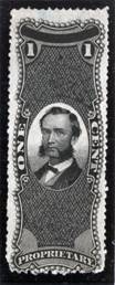
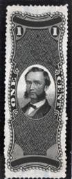
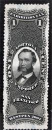 Figure 8.